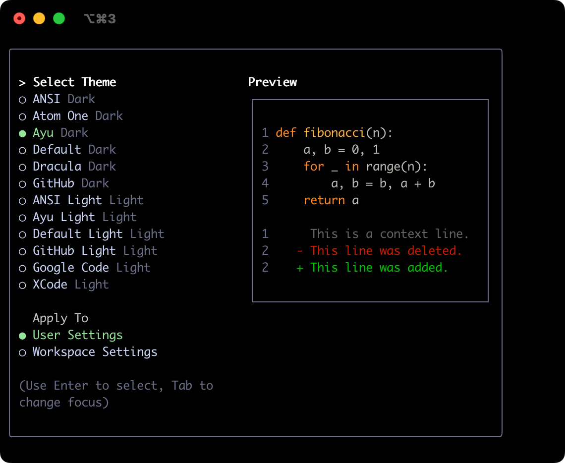
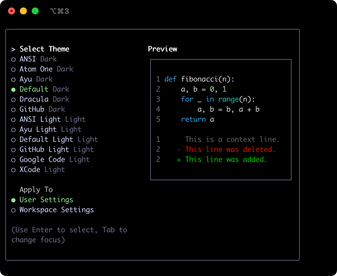
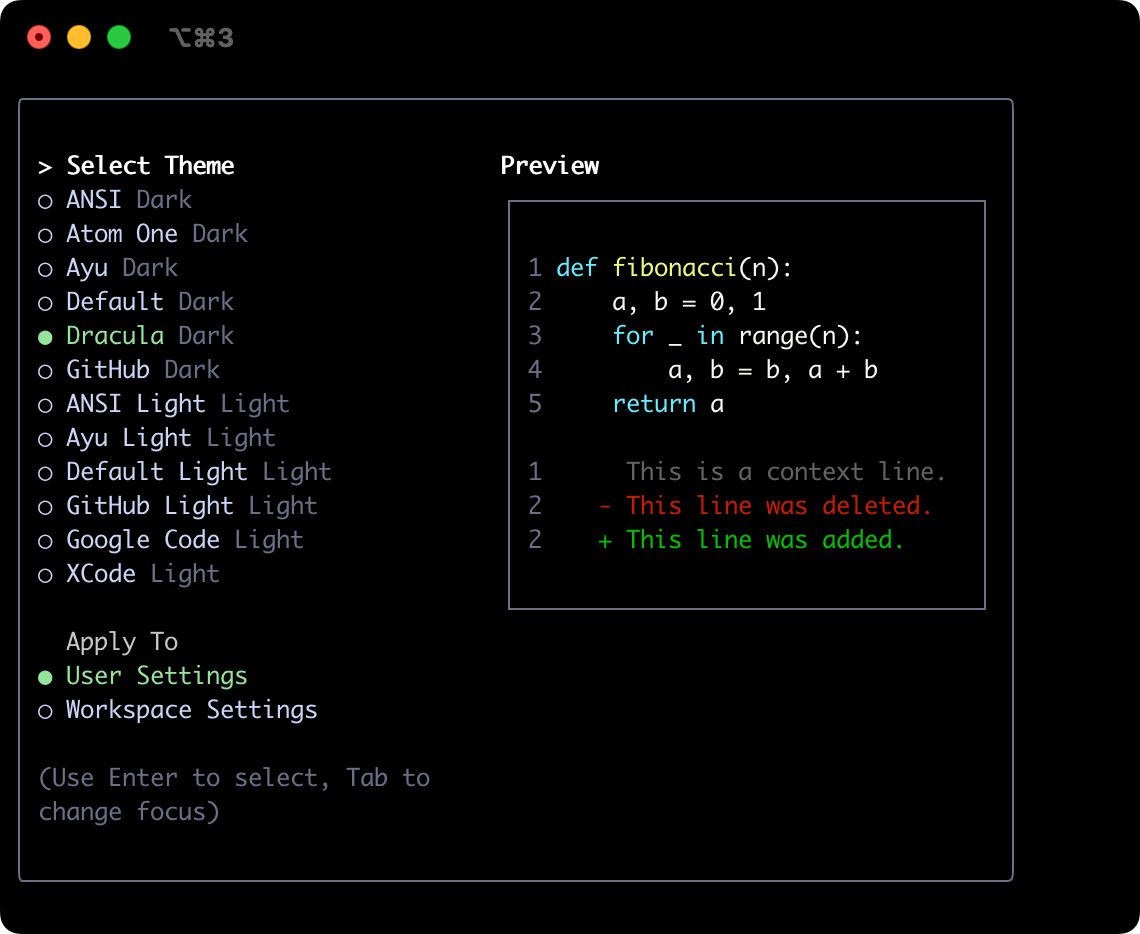
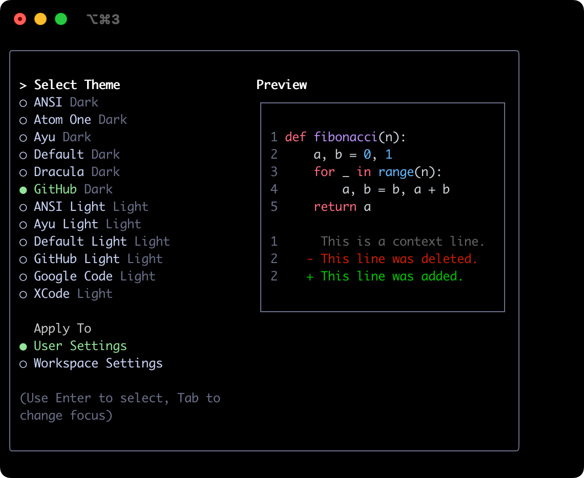
Themes
LLxprt Code supports a variety of themes to customize its color scheme and appearance. You can change the theme to suit your preferences via the /theme command or "theme": configuration setting.
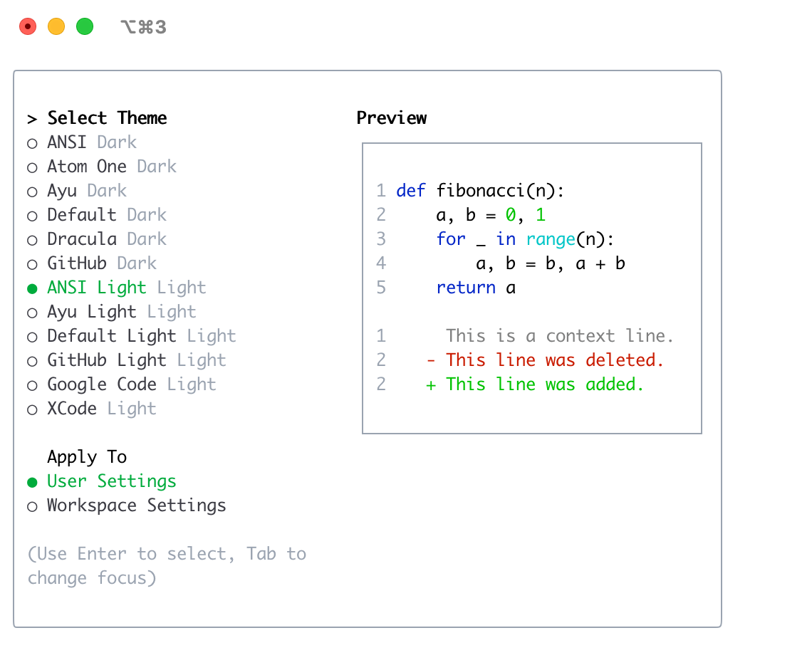
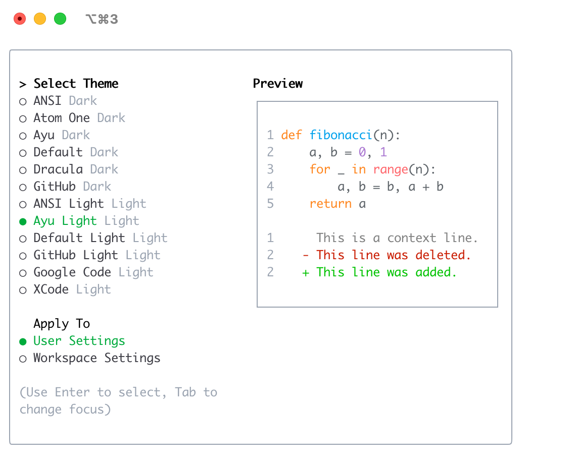
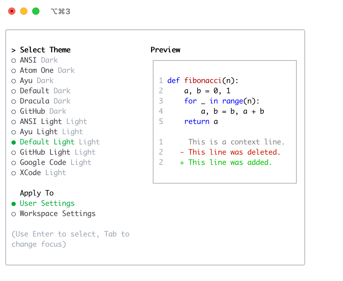
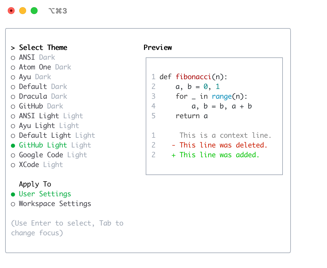
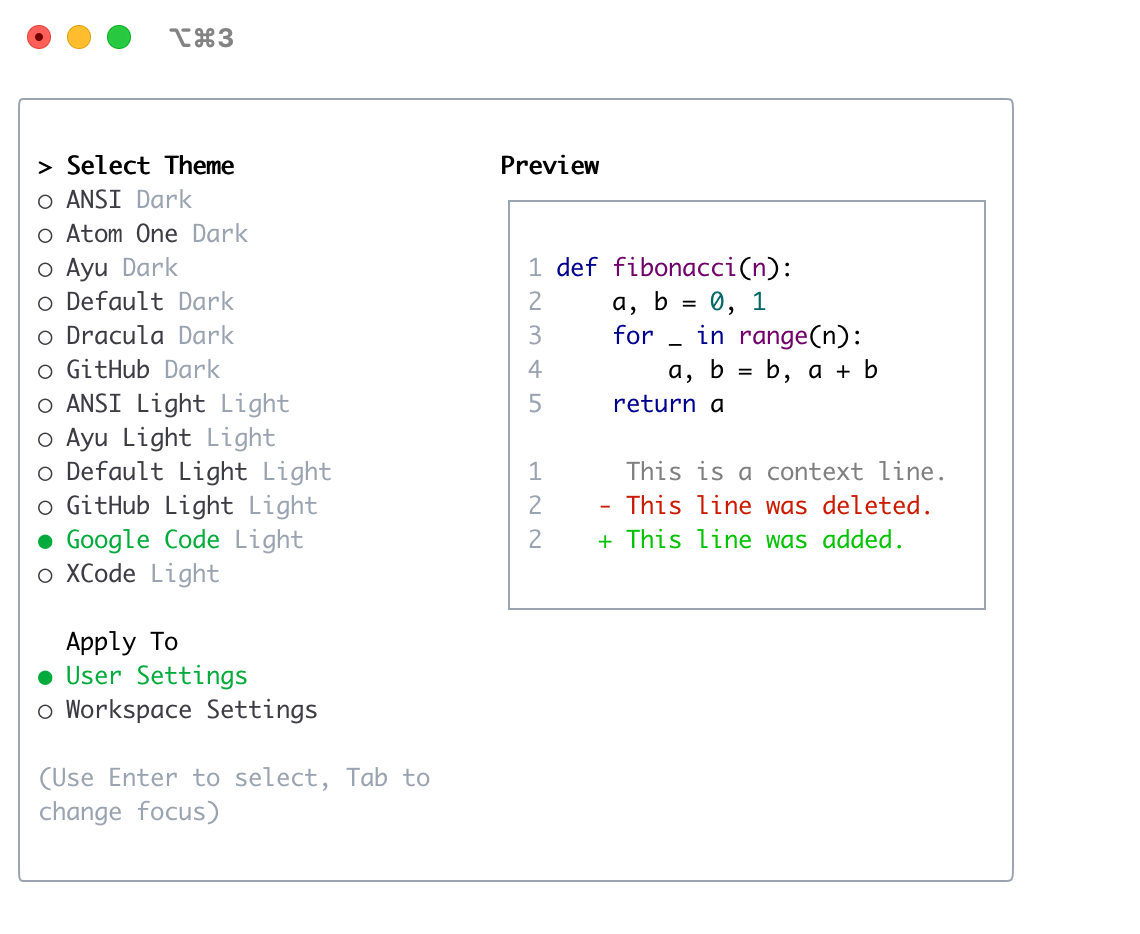
Available Themes
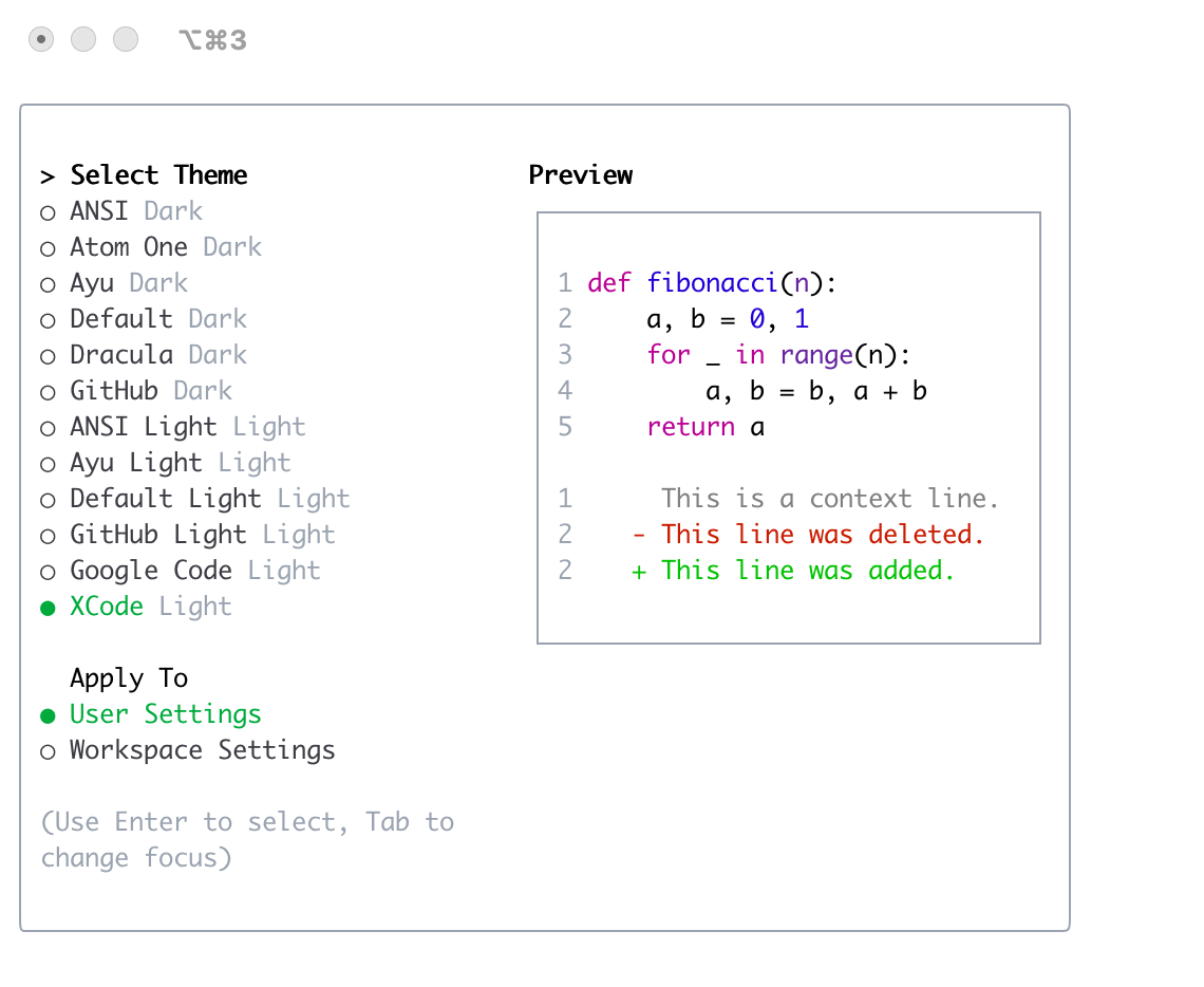
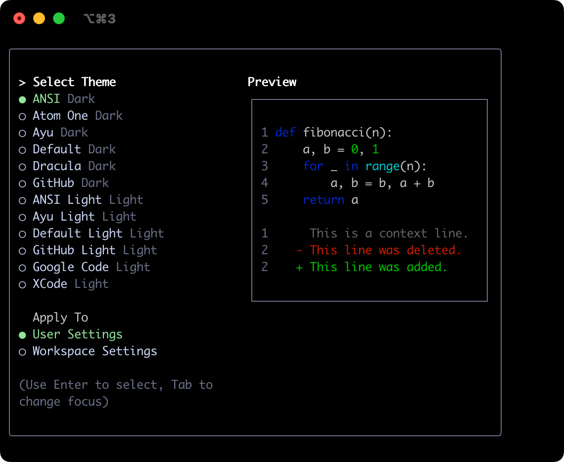
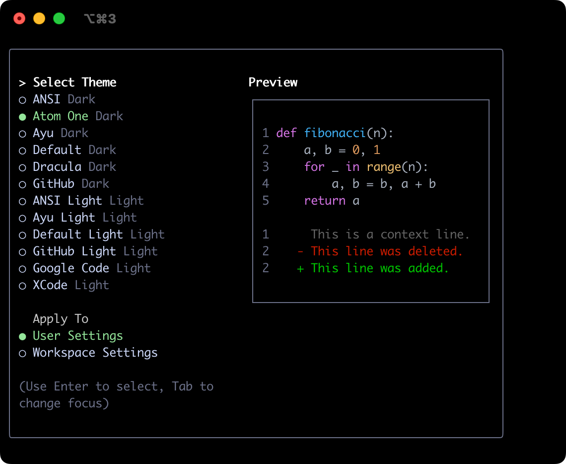
LLxprt Code comes with a selection of pre-defined themes, which you can list using the /theme command within LLxprt Code:
- Dark Themes:
ANSIAtom OneAyuDefaultDraculaGitHubGreen Screen- Classic retro terminal look with green phosphor aesthetics (default)
- Light Themes:
ANSI LightAyu LightDefault LightGitHub LightGoogle CodeXcode
Changing Themes
- Enter
/themeinto LLxprt Code. - A dialog or selection prompt appears, listing the available themes.
- Using the arrow keys, select a theme. Some interfaces might offer a live preview or highlight as you select.
- Confirm your selection to apply the theme.
Note: Theme selection follows the same precedence as other settings (workspace .llxprt/settings.json > user ~/.llxprt/settings.json > system overrides). /theme will update the highest-precedence writable file; you no longer need to delete the "theme" key manually before switching themes.
Theme Persistence
Selected themes are saved in LLxprt Code's configuration so your preference is remembered across sessions.
Custom Color Themes
LLxprt Code allows you to create your own custom color themes by specifying them in your settings.json file. This gives you full control over the color palette used in the CLI.
How to Define a Custom Theme
Add a customThemes block to your user, project, or system settings.json file. Each custom theme is defined as an object with a unique name and a set of color keys. For example:
{
  "customThemes": {
    "MyCustomTheme": {
      "name": "MyCustomTheme",
      "type": "custom",
      "Background": "#181818",
      "Foreground": "#F8F8F2",
      "LightBlue": "#82AAFF",
      "AccentBlue": "#61AFEF",
      "AccentPurple": "#C678DD",
      "AccentCyan": "#56B6C2",
      "AccentGreen": "#98C379",
      "AccentYellow": "#E5C07B",
      "AccentRed": "#E06C75",
      "Comment": "#5C6370",
      "Gray": "#ABB2BF",
      "DiffAdded": "#A6E3A1",
      "DiffRemoved": "#F38BA8",
      "DiffModified": "#89B4FA",
      "GradientColors": ["#4796E4", "#847ACE", "#C3677F"]
    }
  }
}
Color keys:
BackgroundForegroundLightBlueAccentBlueAccentPurpleAccentCyanAccentGreenAccentYellowAccentRedCommentGrayDiffAdded(optional, for added lines in diffs)DiffRemoved(optional, for removed lines in diffs)DiffModified(optional, for modified lines in diffs)
You can also override individual UI text roles by adding a nested text object.
This object supports the keys primary, secondary, link, accent, and
response. When text.response is provided it takes precedence over
text.primary for rendering model responses in chat.
Required Properties:
name(must match the key in thecustomThemesobject and be a string)type(must be the string"custom")BackgroundForegroundLightBlueAccentBlueAccentPurpleAccentCyanAccentGreenAccentYellowAccentRedCommentGray
You can use either hex codes (e.g., #FF0000) or standard CSS color names (e.g., coral, teal, blue) for any color value. See CSS color names for a full list of supported names.
You can define multiple custom themes by adding more entries to the customThemes object.
Loading Themes from a File
In addition to defining custom themes in settings.json, you can also load a theme directly from a JSON file by specifying the file path in your settings.json. This is useful for sharing themes or keeping them separate from your main configuration.
To load a theme from a file, set the theme property in your settings.json to the path of your theme file:
{
  "theme": "/path/to/your/theme.json"
}
The theme file must be a valid JSON file that follows the same structure as a custom theme defined in settings.json.
Example my-theme.json:
{
  "name": "My File Theme",
  "type": "custom",
  "Background": "#282A36",
  "Foreground": "#F8F8F2",
  "LightBlue": "#82AAFF",
  "AccentBlue": "#61AFEF",
  "AccentPurple": "#BD93F9",
  "AccentCyan": "#8BE9FD",
  "AccentGreen": "#50FA7B",
  "AccentYellow": "#F1FA8C",
  "AccentRed": "#FF5555",
  "Comment": "#6272A4",
  "Gray": "#ABB2BF",
  "DiffAdded": "#A6E3A1",
  "DiffRemoved": "#F38BA8",
  "DiffModified": "#89B4FA",
  "GradientColors": ["#4796E4", "#847ACE", "#C3677F"]
}
Security Note: For your safety, LLxprt Code will only load theme files that are located within your home directory. If you attempt to load a theme from outside your home directory, a warning will be displayed and the theme will not be loaded. This is to prevent loading potentially malicious theme files from untrusted sources.
Example Custom Theme
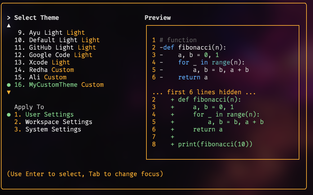
Using Your Custom Theme
- Select your custom theme using the
/themecommand in LLxprt Code. Your custom theme will appear in the theme selection dialog. - Or, set it as the default by adding
"theme": "MyCustomTheme"to yoursettings.json. - Custom themes can be set at the user, project, or system level, and follow the same configuration precedence as other settings.
Dark Themes
Green Screen (Default)
The default theme. A classic retro terminal aesthetic with green phosphor colors, easy on the eyes for long sessions.
ANSI
Atom OneDark
Ayu
Default
Dracula
GitHub
Light Themes
ANSI Light
Ayu Light
Default Light
GitHub Light
Google Code
Xcode